Designing an Animated, Circular Progress Bar with SVG
I needed a progress bar to demo my new product, so I copied Twitter's circular progress bar and added some extra style! 😍
I needed a beautiful progress bar to demo my new product, a polite email signup form for writers, bloggers, and creators 💁♂️, but I'd never built one before.
The Final Result 🤩
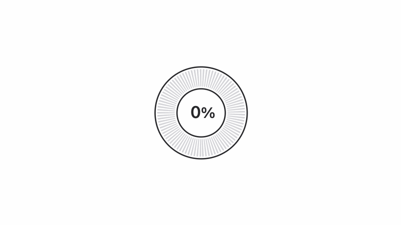
This is the final demo of the circular SVG progress bar I made after a lot of research and trial and error!
And here's a Codepen demo with all the code.
Now, let's talk about the full story — back from the beginning when I thought a vertical progress bar might be the solution. 😒
Attempt #1 (Vertical Progress Bar)
The original idea was just to show a simple vertical progress bar inspired by a phone's battery status.
But since this demo is going to be one of the first impressions get of the product, I wanted the design to be really beautiful.
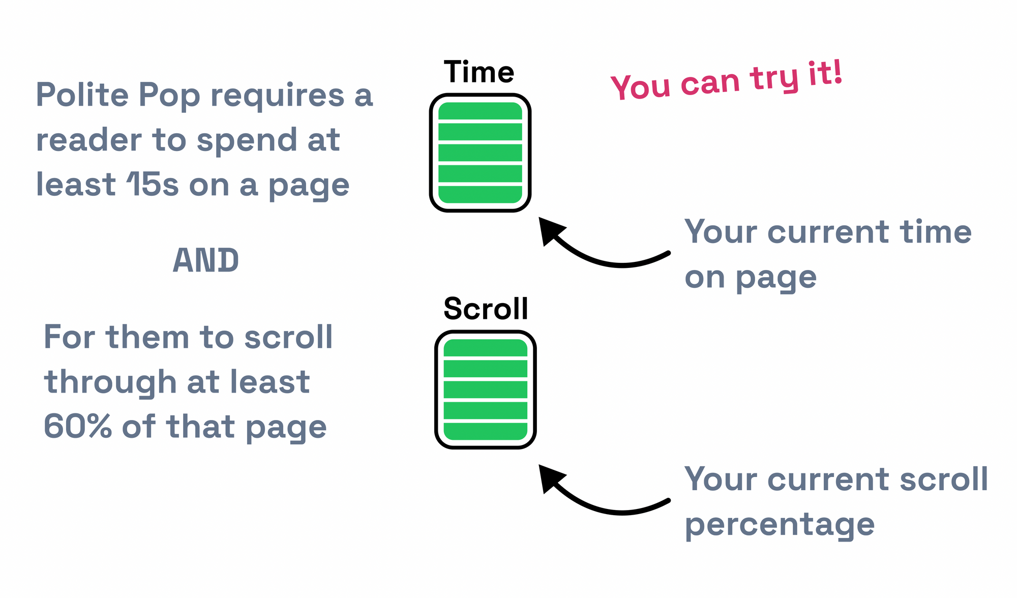
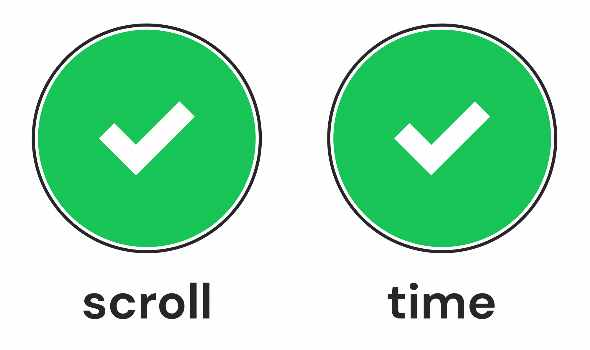
Attempt #2 (Real-world-inspired Progress Bars)
For the next iteration of the design, I went in a more creative direction that would give the user a real-world feel of what each progress bar meant.
- The scrolling indicator would look & feel like scrolling the actual page.
- The timing indicator would look like an actual clock.
I decided against these for one simple reason: they were unfamiliar UI elements, so the user would need (precious) time to understand them. Whereas I wanted them to intuitively understand the demo right away.
Attempt #3 (Simple Circular Progress Bars)
The next attempt was my favorite by far.
I've always liked circular progress bars: they're beautiful, they're intuitive, and they convey so much information in a very compact amount of space.
And the ones I designed (after watching a quick Figma tutorial) were simple, while also feeling unique and cool — like a futuristic smartwatch ⌚️
Okay, but how do I make this? 🧐
I always prefer to design before coding because then I find the right solution and not the easiest-to-implement solution. But that approach sometimes leaves me with difficult-to-implement designs that I love.
My first stop was CSS.
I love CSS — it's easy to work with, the animations are buttery-smooth, and you can implement a lot of complex designs with just a little extra thought.
My research started off strong. I found a tool that lets you generate circles with dashed borders by plugging in a few simple options.
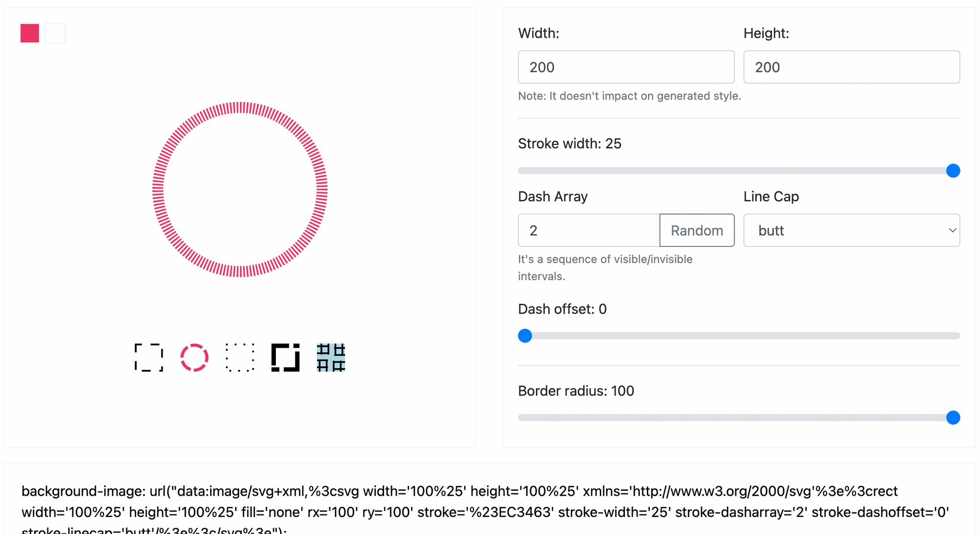
And then I found a great tutorial about how to make a circular progress bar in CSS.
All I needed to do was put these two concepts together somehow and I'd be able to create my design with pure HTML & CSS.
But something felt off... there were a lot of hacks to get this working:
- The animation was actually just two rectangles rotating around inside of a circle, so I'd have to write some code to get them to represent just on percentage number (1-100)
- The animation was defined in CSS, so it couldn't be controlled from JS to represent an actual progress number unless I coded it in JS
- The dashed border was defined as an SVG background image instead of being natively implemented in CSS
Despite all of this, I was prepared to go ahead with this solution.
But then I saw these comments on a Dev.to article:
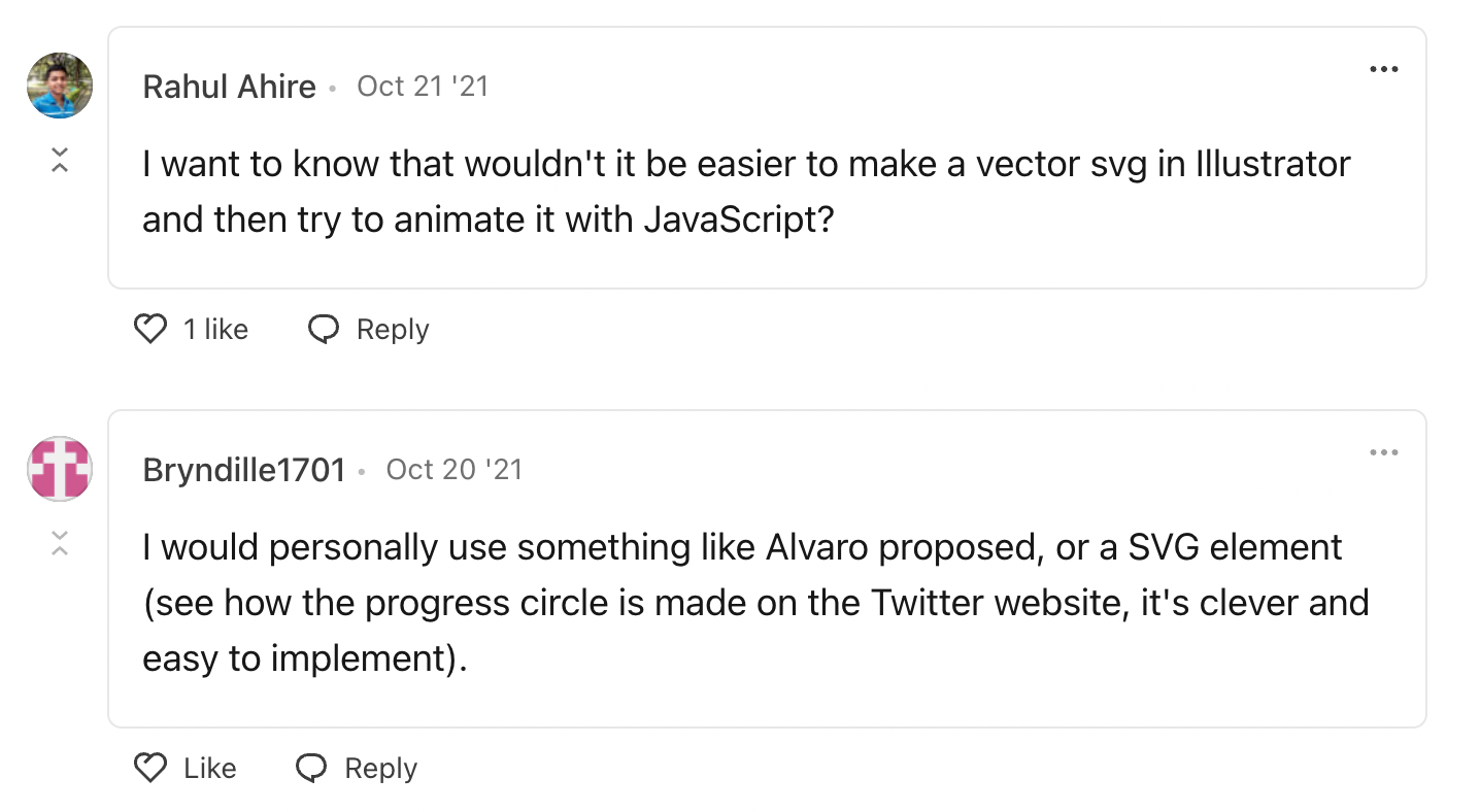
And it clicked 😊👌
An SVG!
- The whole animation is just circles
- Hand coding circles in an SVG should be relatively simple!
- In the second comment, "Bryndille1701" even mentioned that Twitter already does this with their character counter
Hand-coding an SVG
The first thing I did was download the code for Twitter's circular progress indicator directly off of Twitter.com:
It's pretty simple, there's only a couple parts to figure out:
- They draw two circles and have the blue progress circle overlap the gray background circle
- The blue progress circle's length is determined by
stroke-dashoffset: 12.29014; stroke-dasharray: 56.5487;, wherestroke-dashoffsetis the empty space that's not filled up with blue andstroke-dasharrayis the circumference of the circle - They rotate the entire SVG with
transform: rotate(-90deg)to get the blue progress bar to star from the top
In order to get my own design working, I just needed to play around with the circles until I could draw:
- The gray dashed circle in the background
- The green foreground progress circle
- The inner and outer black lines that act as their borders
It was actually pretty simple.
The gray dashed circle looks like this:
<circle cx="50%" cy="50%" fill="none" stroke-width="20" r="40" stroke="#D4D4D8" stroke-dasharray="1.4137,1.4137"></circle>The secret here is just to have a large stroke-width and use a stroke-dasharray that's small and won't cause to dashes to overlap each other (I used a factor of the circumference to pull this off).
The green foreground circle looks like this:
<circle class="progress-bar" cx="50%" cy="50%" fill="none" stroke-width="20" r="40" stroke="#19C558" style="stroke-dashoffset: 251.3274; stroke-dasharray: 251.3274;"></circle>This one was a little harder, but not by much. It has the same width and radius as the gray circle. But we do need to define its stroke-dashoffset and stroke-dasharray.
The stroke-dasharray needs to be the circumference of the circle, we need to do a little math:
2 * 3.14159265359 (π) * radius (40)Which gives us: 251.3274! 🎉
The inner and outer black stroke circles were easy in comparison. I just played with their radius until they looked like the design:
<circle cx="50%" cy="50%" fill="none" stroke-width="1.5" r="27.5" stroke="#27272A"></circle>
<circle cx="50%" cy="50%" fill="none" stroke-width="1.5" r="52.5" stroke="#27272A"></circle>
Adding a Progress Percentage
In the past, I've found working with text inside of SVGs to be a pain (it renders weirdly in some browsers and on some machines).
So for the progress percentage, I decided to code that up in raw HTML and just layer it on top of the SVG.
<div class="progress-text-container">
  <div class="progress-text">
   <span class="progress-text-inner">0</span><span class="progress-text-percent">%</span>
  </div>
</div>
Drawing a Success State
The last thing to do was to show what happens when the progress percentage reaches 100%.
This was actually a lot of fun. It was hard because the checkmark would be rotated 90 degrees just like the rest of the SVG, so I needed to draw it sideways, but other than that it was just a big green circle with a simple polyline (what you use in SVG when you want a line that bends).
<circle cx="50%" cy="50%" fill="#19C558" r="50"></circle>
<polyline points="52 74, 65 60, 40 36" stroke="#fff" fill="none" stroke-width="10" />
Demo (Putting It All Together)
Then I just needed to code up the JS to animate the progress bar and change the progress text — and everything worked!
Recommended reading: "How to Code SVG Icons by Hand" (an amazingly helpful guide that clarified viewbox, polyline, and showed me how hand-coding SVGs isn't that hard!)